Convert visitors into paying customers: Top 3 tips!
Top 3 tips to boost your online conversions without wasting a lot of time. Turn visitors into paying customers with a few tricks.

This article will teach you the best practices to boost conversions right away.
While there are many things you can do to optimize your landing page for conversions, there are 3 things I always find giving me instant results.
1 - Optimize the headline
Within just a few seconds, the user will decide whether to stay on your page or bounce of to another site. A good headline can convince the user that your website is worth spending time on.
Keep it between 4 - 6 words
The headline should be short and concise. A sentence between 4 and 6 words will have higher conversion rates than both shorter or longer sentences.
Be on point, but keep it interesting
There is nothing worse than a boring headline. Spend a bit of time on your landing page headline. A subtle difference can make a huge impact on online conversion.
A/B-test different headlines
You'll be surprised how much a subtle change in your headline can impact conversion rate. A/B-testing will sort out which headline works and which doesn't.
The best way to perform A/B-testing is to use Google Analytics or some other tool to automate the process for you. I don't recommend you to perform manual A/B-testing.
Just remember that you push enough traffic to the site that you can trust the metrics. You need at least 500 visitors to pick a winner. I usually aim for about 1000 visitors when I run my A/B-tests.
2 - Color and contrast
This is quite important. You need to use colors and contrast to attract attention to the part of the page that is important to the user. Usually, this is the action button or sign-up form.
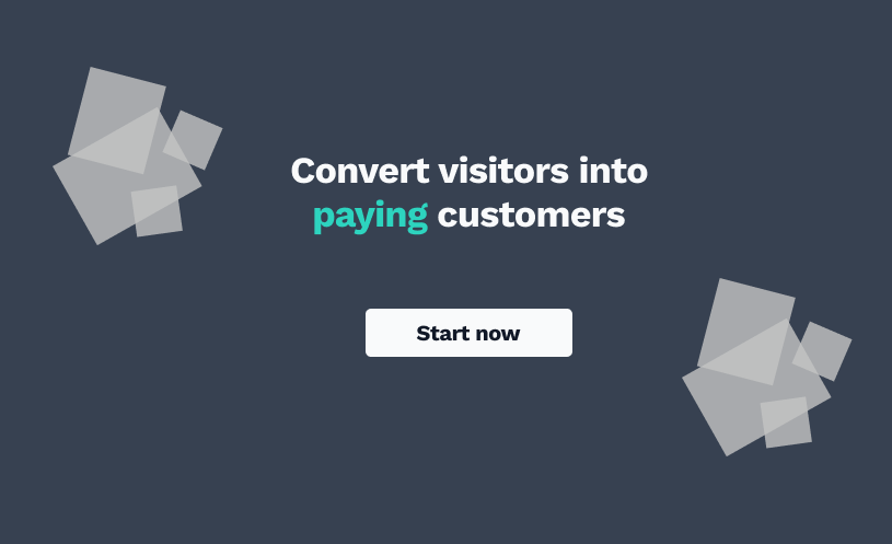
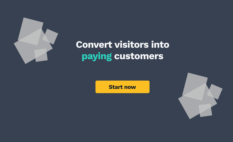
Look at the difference between the two simple landing page designs below:


The last one pops more because of the contrasting color on the CTA button (Call-to-action).
Please don't overdo it
Colors are fine and all, but don't go over the top. My best tip is to keep things as clean as you possibly can.
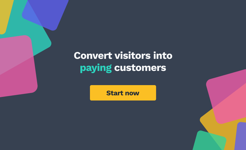
If you make your landing page too colorful, you will create a visual overload for the user. You want the CTA button to pop out.

De-clutter your design
Making a clear design that helps your user focus on what you want is not always easy. But keeping the number of different colors in your design to 3 or 4 will force you to create a more clean design.

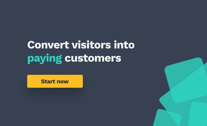
As you probably can tell, the difference between the first and last design is quite big.
I've scaled up the text, given the CTA button a drop-shadow, and cleaned up the design. This leaves us with a landing page that will convert visitors into paying customers.
3 - Optimize call-to-action text
I highly recommend you test different texts on the CTA button. But in general, you should keep it short.
As with the headline, the text on the CTA button can have a huge impact on your conversion rate.
But including a "you" or "your" to make it more personal is, in our experience, often better.
"Check price now" is not as good as "Get your quote".
If you think it's hard to find good CTA-texts, you are not alone. But as with the headline, the CTA-text is important, and you should use a bit more than two minutes on it.
Conclusion
Creating a good landing page that converts visitors into paying customers can be the difference between success and failure. But I'm still amazed by how many that misses the basics of well-converting landing pages.
I hope that this article helped you understand how to create higher converting landing pages. Here is a short-formed summary:
- Keep headline between 4 and 6 words
- Be on point, but keep the headline interesting
- Use contrasting colors in your design, but don't overdo it
- De-clutter your design - keep it clean and clear
- Optimize your CTA-button text - try out different variations
- A/B-test your landing page - minimum 500 visitors before you declare a winner
Want help?
If you need a new and high-converting landing page or you need help optimizing your existing home page. Don't hesitate to contact us.
